The Duality of Light: A Deep Dive into Photographic Contrast
The Philosophy of Opposites
In the quiet corners of our studio here at Salt Media, we often talk about the 'weight' of an image. If a photograph is a symphony, contrast is the percussion—the sharp, definitive strike that brings order to the chaos of light. To understand contrast is to understand the very engine of photography itself. At its core, contrast is the measurable difference in luminance or color that makes an object distinguishable. Without it, we are left with a gray, formless void.
Etymological Foundations
The term contrast descends from the Latin contra-, meaning 'against,' and stare, meaning 'to stand.' Thus, to contrast is to 'stand against.' It is the visual equivalent of a dialectic argument; one value pushes against the other, creating a boundary that our eyes crave. Long before the camera, painters of the Baroque period mastered this through chiaroscuro, but in the medium of photography, the concept transitioned from a stylistic choice to an inherent physical property of chemistry and physics.
The Evolution of the Gradient
When we look back at the early experiments of the 19th century, contrast was often a byproduct of failure rather than intent. Early plates struggled with the physics of sensitivity, often resulting in muddy mid-tones or stark, blown-out highlights. It took decades of iterative chemistry—from the silver-rich coatings of the daguerreotype to the nuanced emulsions of the 20th century—for photographers to gain true 'tonal agency.' We learned that contrast was not merely a 'high' or 'low' setting; it was a sliding scale that dictated the emotional temperature of the narrative.
Contrast is the dialogue between the void and the vibrant; it is where the story finds its edge.
The Technical Anatomy of Contrast
Technically, contrast is defined by the difference between the darkest and lightest areas of an image. In the digital age, we view this through the lens of the histogram, a mathematical map of our exposure. However, we must distinguish between three distinct types of contrast:
- Luminance Contrast: The difference in light intensity, which provides the primary structural backbone of a composition.
- Chromatic Contrast: The interaction of colors, often utilizing complementary hues to create vibration and depth.
- Conceptual Contrast: The juxtaposition of opposing themes—the aged face against the modern machine, or the silence of a desert against the roar of the city.
Mastering contrast requires a departure from the 'auto' mindset. It requires the photographer to see the world as a collection of values rather than objects. When I teach my students here in Colorado, I ask them to squint. When you squint, the fine details vanish, leaving only the primary blocks of light and shadow. That is the architecture of your image. If the squint test reveals a flat, mushy composition, your contrast is failing the viewer.
The Art of Intentionality
High contrast commands attention; it is aggressive, clear, and dramatic. Low contrast, conversely, invites intimacy; it is whispered, subtle, and melancholic. The true master of photography does not simply apply high contrast to 'make it look better.' Instead, they wield it to clarify the intent. In my own work, I often find that the most powerful images exist in the mid-range—the delicate transition zones where textures are preserved, and the eye is invited to linger rather than glance and move on.
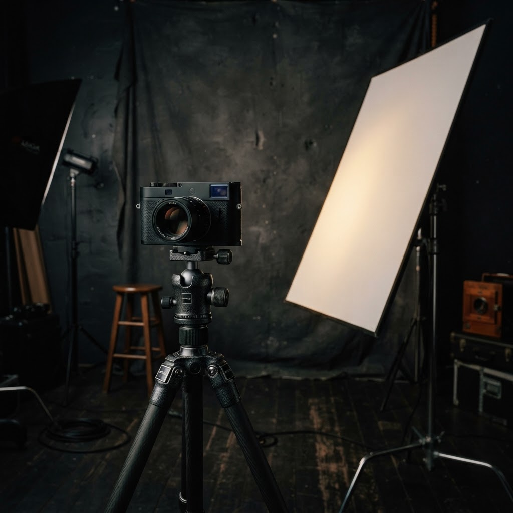
Ultimately, contrast is a tool of perception. It reminds us that in life, as in art, it is the tension between the polarities that gives life its shape. Whether you are working with the unforgiving light of a high-noon sun or the gentle, soft-rolled shadows of a studio softbox, remember: you are not just capturing light. You are defining the space between things. That is where the magic lives.